Brean Theme Park
- Brean Theme Park
- Design, Print
- Branding, signage, ride graphics, print and stationery
The designer behind one of the UK's biggest free admission theme parks: the brand, the signage, the ride graphics and nearly everything a visitor reads from the car park to the last ride.
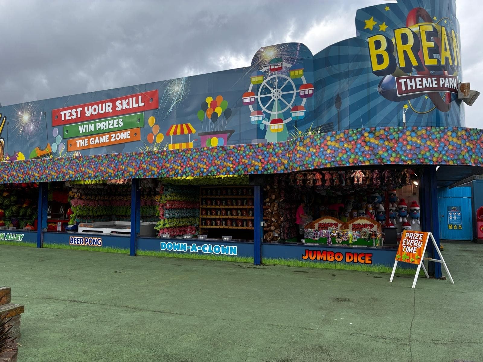
Brean Theme Park on the Somerset coast is my biggest client, and I'm in charge of how it looks: the branding, all the signage, the ride graphics, flyers and posters, the park map, menus and food screens, business stationery and the social posts that sell each season. It all follows a brand manual I wrote, so printers and anyone else making artwork for the park work from the same rules.
It runs on one idea. Rides are sold by wristband (Mega for over 1.2m, Junior for 1.0m to 1.2m, Tots for 0.8m to 1.0m), and blue, red and orange are the brand colours and the wristband colours at the same time. Every ride board is in its wristband's colour, so a family that knows its wristband can spot which rides are theirs from across the park. Opening days have their own code too, from blue full days to red fireworks evenings, and it's the same on the welcome sign, the calendar and online.
The work runs from building scale to pocket size: the Game Zone frontage, ride panels and the roadside Free Entry sign, down to game rules, guest passes and the info desk pad. Through the year come the promotions (fireworks nights, Big Day Out bundles, end of season offers) and the overlays that update a sign mid-season instead of reprinting it.